The development and design teams have been hard at work over the past few months to bring you this latest update.
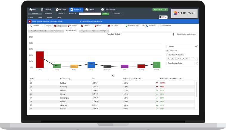
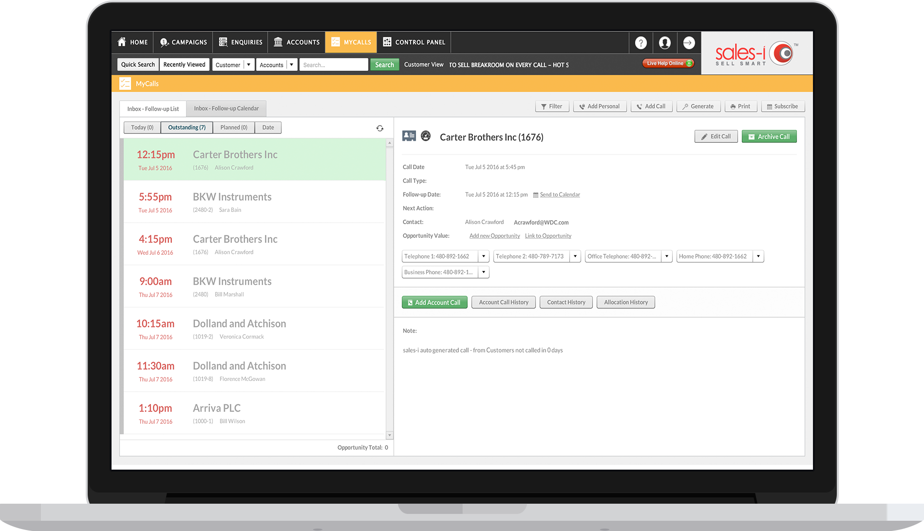
We’re very excited to announce a completely new look web version of sales-i.
This facelift makes the system as nice to look at as it is effective to use.
The way the system works is exactly the same. The only thing that’s changed is that the Support, My Profile and Logout buttons are now symbols in the top right, next to the logo.
Flattened images, softer colors and a new font that’s easier to read make for a much nicer experience when using the system, and also make navigation through sales-i easier.

We’ve done this to make using sales-i a more enjoyable experience for you, our users. We’ve been so heavily focused on developing the way the system works for so long that we thought we’d dedicate some time to change how it looked; this refresh brings it bang up to date.
If you’ve got any feedback, questions or queries about the new look sales-i, please get in touch and let us know.
Enjoy!
The sales-i team
Note: to enjoy this latest update, you might need to clear your cache. If you need help doing this, click here to learn more.
